Page 1 of 3
My Skin's
Posted: Tue May 11, 2010 8:23 pm
by wrighty1986
Re: Gray skin
Posted: Tue May 11, 2010 9:21 pm
by mikethedj4
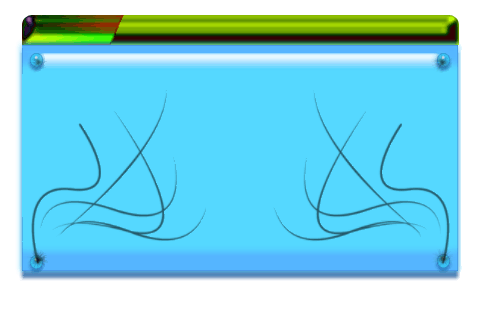
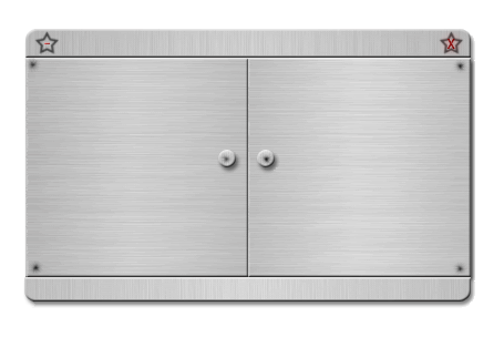
1st I rate an 8, very nice and simple, no errors. Just really nice.
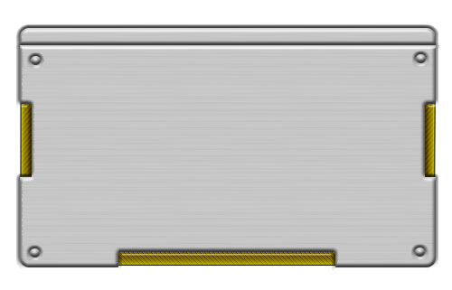
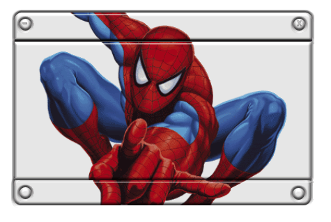
2nd one I rate a 3, I just done like how it's oriented.
Re: Gray skin
Posted: Tue May 11, 2010 10:15 pm
by wrighty1986
Cool mate i like 1st 1 better 2nd 1 looks shitsh cud of made a better job lol thank's for coment.
Re: My Skin's
Posted: Thu May 13, 2010 7:06 am
by hungryhounduk
Well the 1st one i think looks pretty good = 8
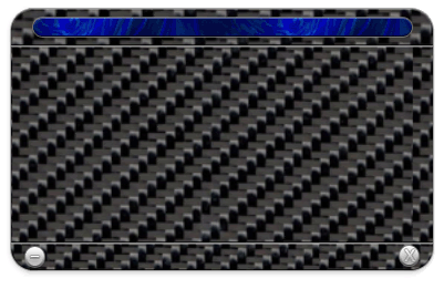
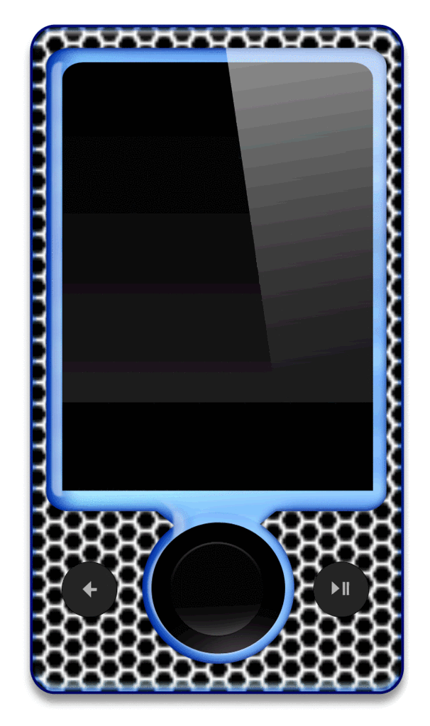
The others = 3
Re: My Skin's
Posted: Thu May 13, 2010 12:29 pm
by wrighty1986
Thank's hungryhounduk 2 & 3 tuc me about 5 mins but goin do more an spend more time on um.
Re: My Skin's
Posted: Thu May 13, 2010 6:22 pm
by ManMega1
hmm, i like them, they'd be better with a a transparant background though.
My ratings -
1 - 8/10
2 - 2/10
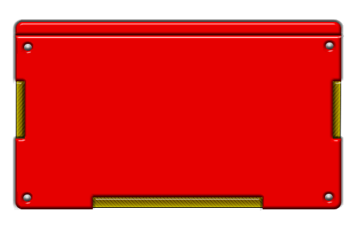
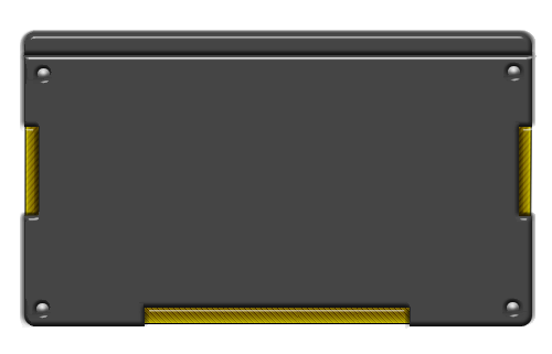
all the others - 5/10 or 6/10
but, i quite like them

Re: My Skin's
Posted: Thu May 13, 2010 6:55 pm
by Livengood
i give you a 9/10 on all of the

Re: My Skin's
Posted: Thu May 13, 2010 6:59 pm
by wrighty1986
Thank's Livengood
Re: My Skin's
Posted: Thu May 13, 2010 7:06 pm
by wrighty1986
hmm, i like them, they'd be better with a a transparant background though.
My ratings -
1 - 8/10
2 - 2/10
all the others - 5/10 or 6/10
but, i quite like them
Why ant thay transparant background when in vb.net u can do it that way so if i transparant the skins its dont work proper on the skins. goofy;
Re: My Skin's
Posted: Fri May 14, 2010 2:02 am
by mikethedj4
You know what I think about the first image, and I noticed you added some, I do like this image.
![Image]()
I'm rate that about 7, the button like parts need to be fixed, but it's pretty cool. All the other skins I don't like, or are ok.